Clu Health
Clu is a medical supplement brand focusing on minimizing the risks associated with Alzheimer’s disease. The assignment was to create a visual language for the brand through the design of packaging, form factor, identity and web site. On this page is a range of concept studies and iterations developed while working towards a final look for the brand.
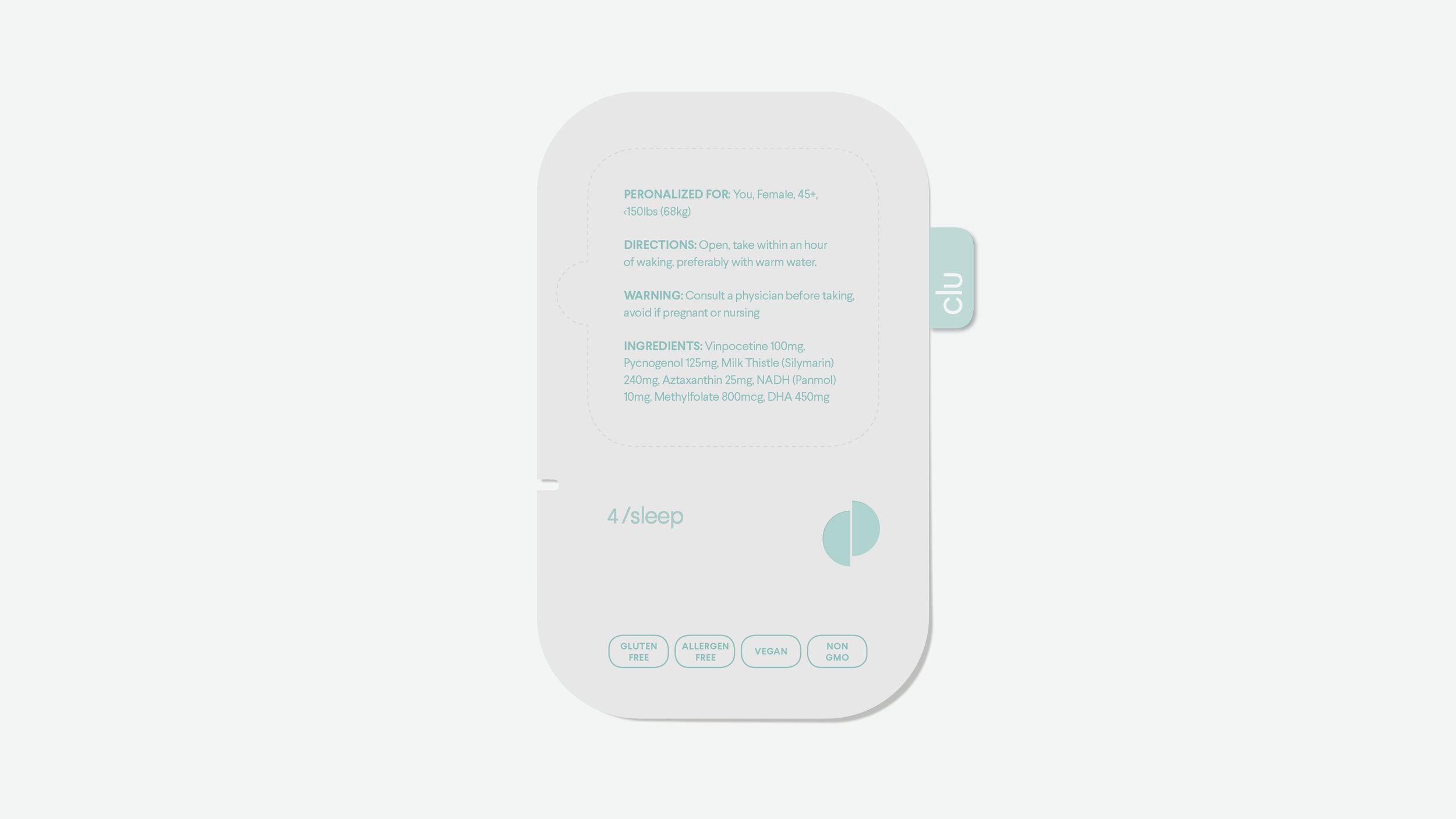
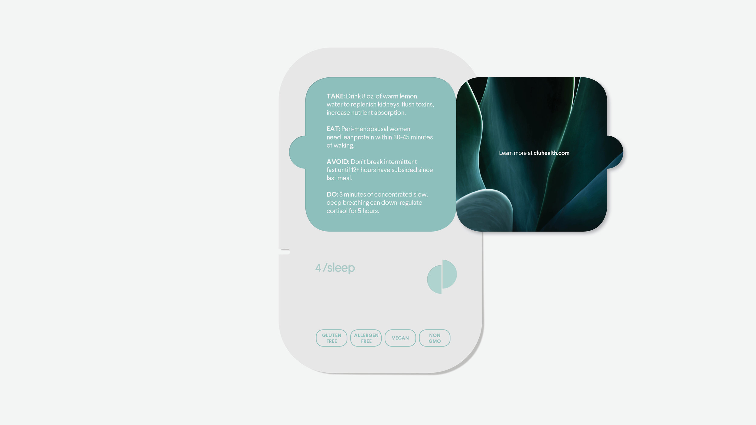
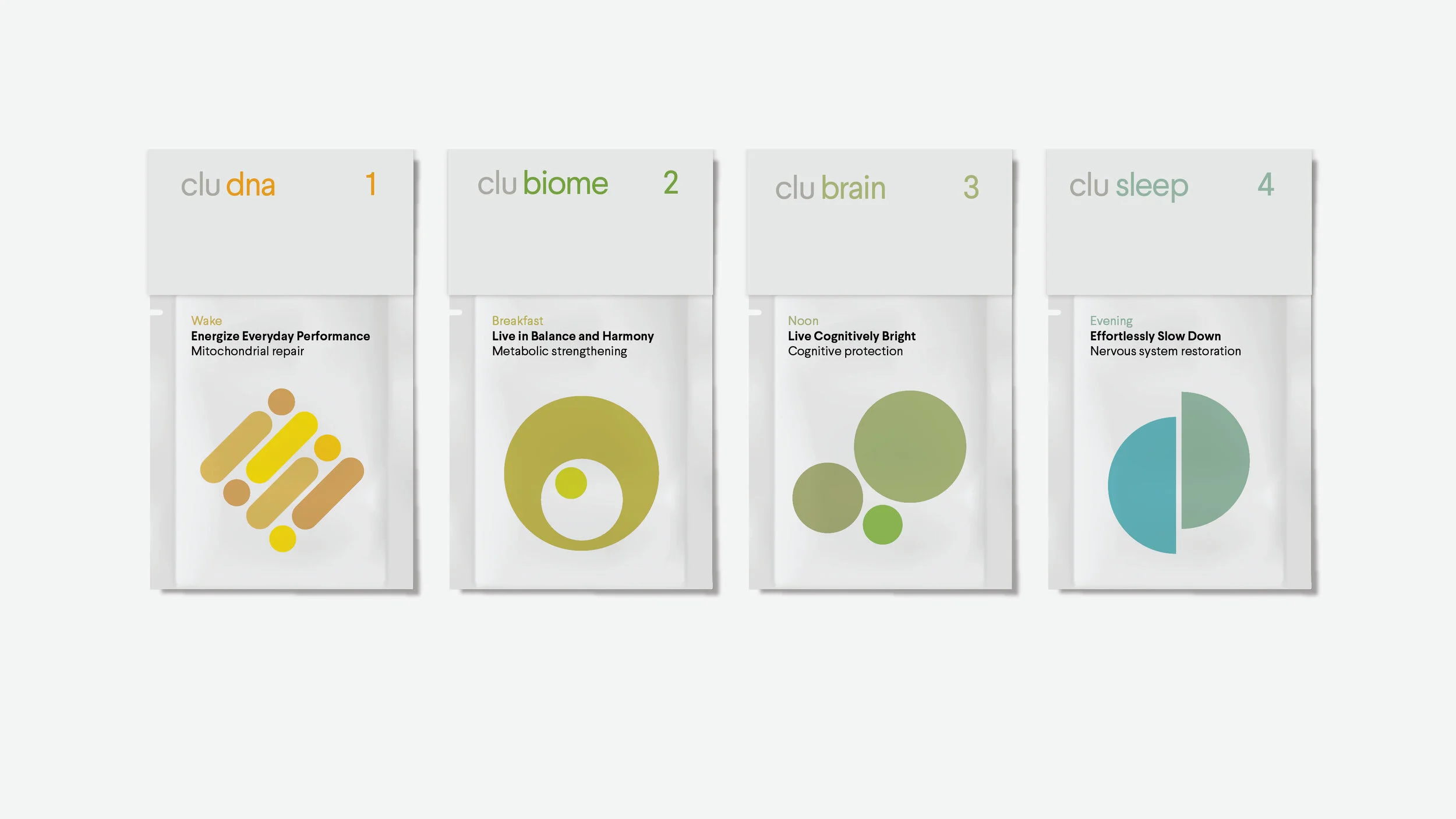


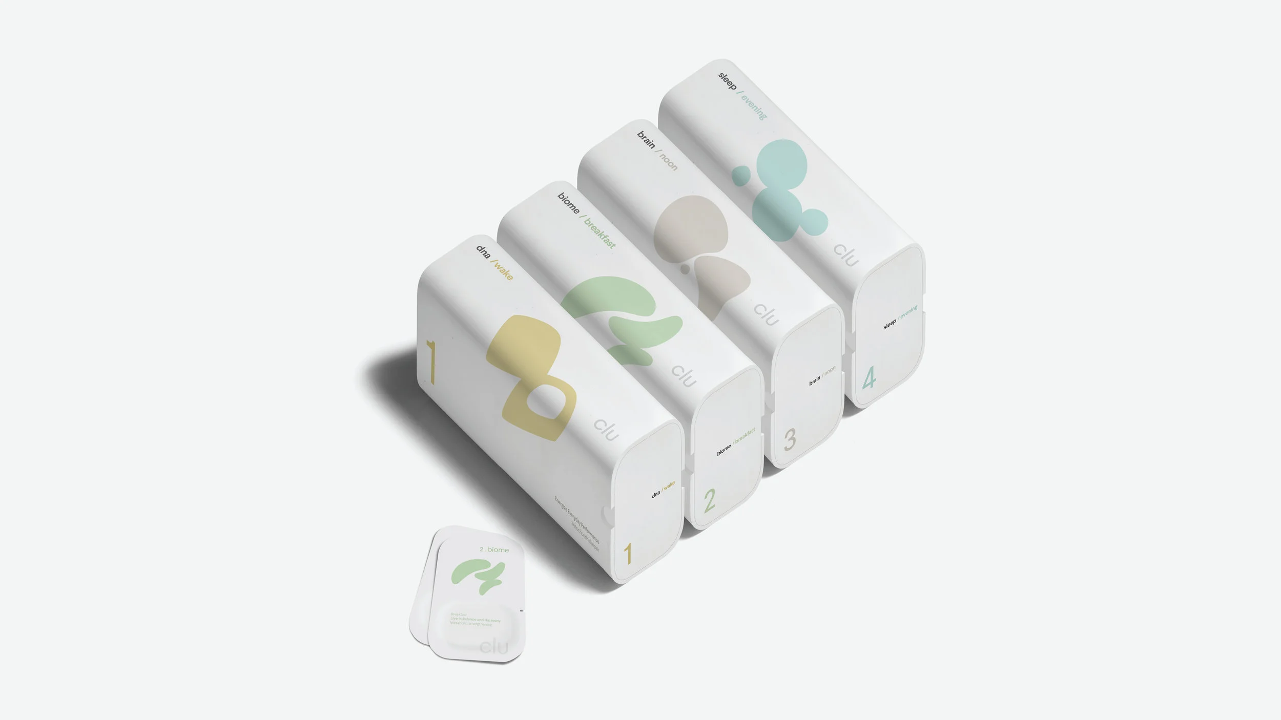
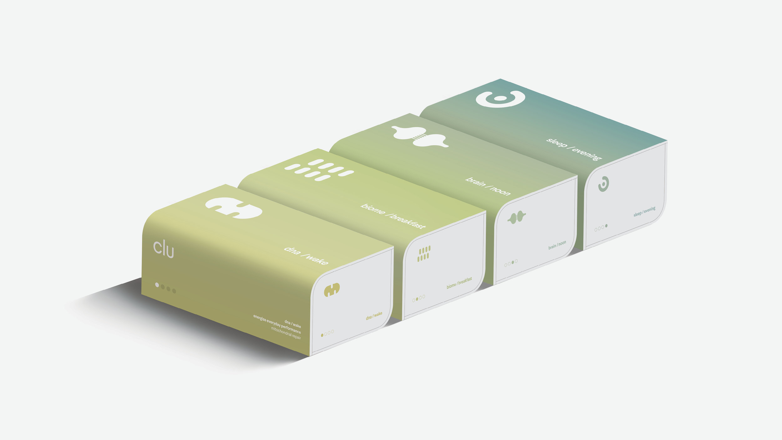
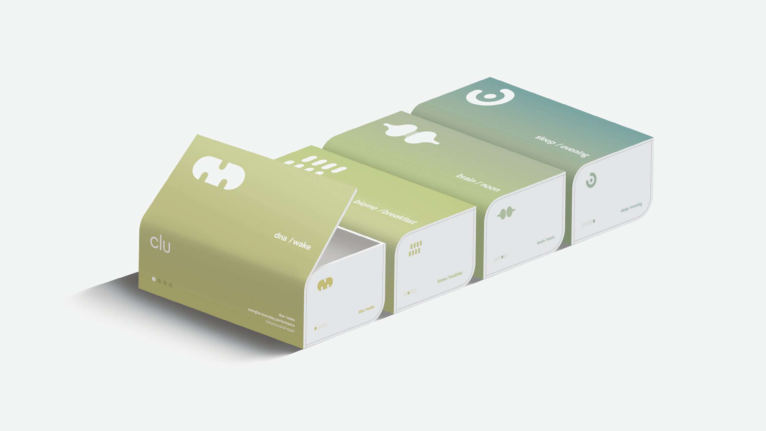
The system of supplements utilizes 4 pathways in the body taken each day and stored in 4 separate boxes. In the early stages of design exploration, the formulary hadn’t been determined, so various approaches to the packets were taken: liquid, pill, powder, etc.


A continuum to the day — from sunrise to evening — is communicated through gradations, the selection of indivual colors within a narrow palette or artwork that connects across the packets and boxes.


The overall visual tone needed to balance several aspects of the brand: upscale yet not luxury, skew female without alienating a male audience, modern and minimal while still human and, finally, optimistic but not so much that the science isn’t taken seriously.

While this is about a disease of aging, the goal is prevention. So the target age for the brand is closer to 40, instead of 70. We also wanted to be a supplement that was neither performance fuel nor cosmic, hippy dust, but a third category that felt modern, confident and trustworthy.